Drops // Usability Testing
Class Project
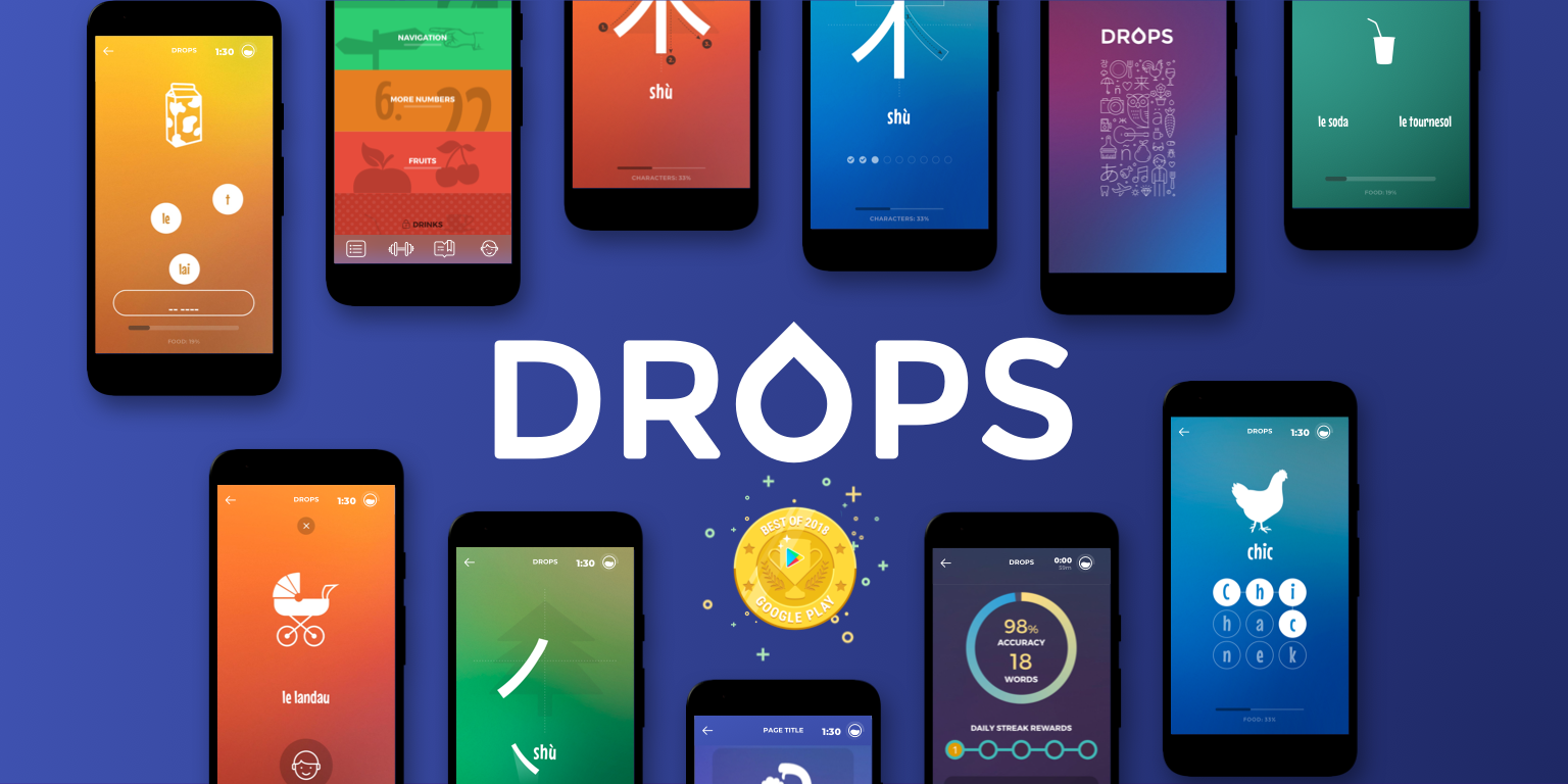
What is Drops?
Drops is a language learning app that gamifies the language learning experience. In addition to adding a playful feel to their app through games, Drops also heavily uses animations and gradients to enhance the playfulness of their app.
Objective: In this project me and a team of 4 set out to discover: what aspects and features of Drops advance the language learning experience. What aspects hinder it? Where in the app do users get hung up due to a lack of usability? And where does the app perform best?
Skills Used
Cognitive Walkthrough
Interviewing
Heuristic Evaluation
Affinity Diagramming
Competitive Analysis
User Testing
Collaboration
Heuristic Analysis & Cognitive Walkthrough
To initiate my usability test of Drops, I performed a heuristic analysis and conducted a cognitive walkthrough of the app. Upon concluding the test I discovered the following:
Areas of strength:
Strong sense of hierarchy
Meticulous alignment
Strategic use of animations
Areas for improvement:
Distracting busy backgrounds
Lack of comprehensive error prevention
Incomplete implementation of design patterns
Through these comprehensive tests, I gained an early assessment of the app's usability. Subsequently, I collaborated with my team to analyze the gathered data, before working together to identify the target users of Drops.
Lack of Error Prevention.
No detailed error message conveying what is wrong.
Violates Nielson's 5th Heuristic:
Error Prevention
Confusing UI Elements.
The icons at the top of the screen appear to be on a carousel, however they are stagnant.
Violates Nielson's 4th Heuristic:
Consistency and standards.
Distracting Design.
The bright colors and gradient on the page distract the user from the vocab words.
Violates Nielson's 8th Heuristic:
Aesthetic and minimalist design
Conceptual Interviews
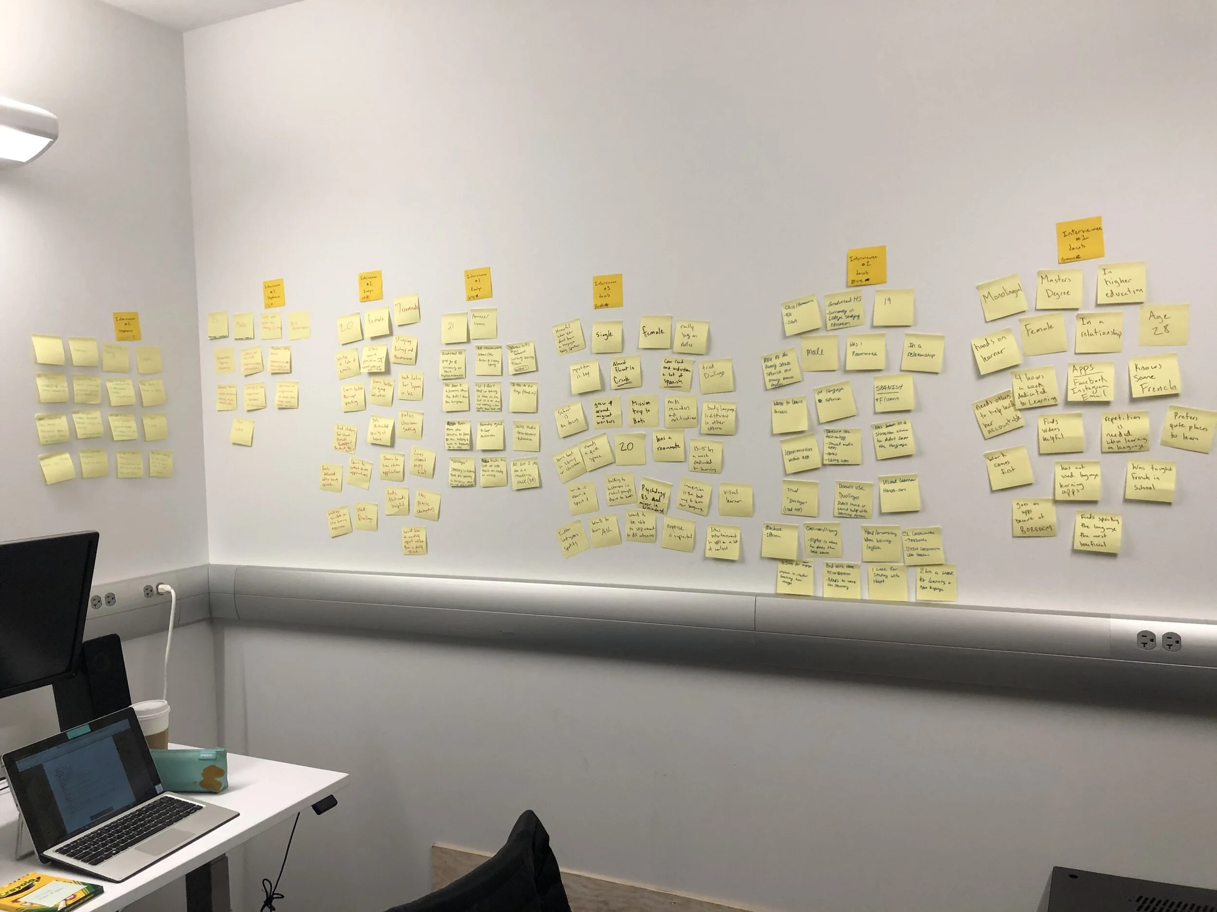
Upon establishing our target users, we enlisted 8 interviewees to gain deeper insights into their needs. Crafting a comprehensive interview script enabled us to identify trends in their responses.
Key areas of inquiry included understanding:
Optimal learning methods
Most frequently used types of apps
Past experiences in learning new languages
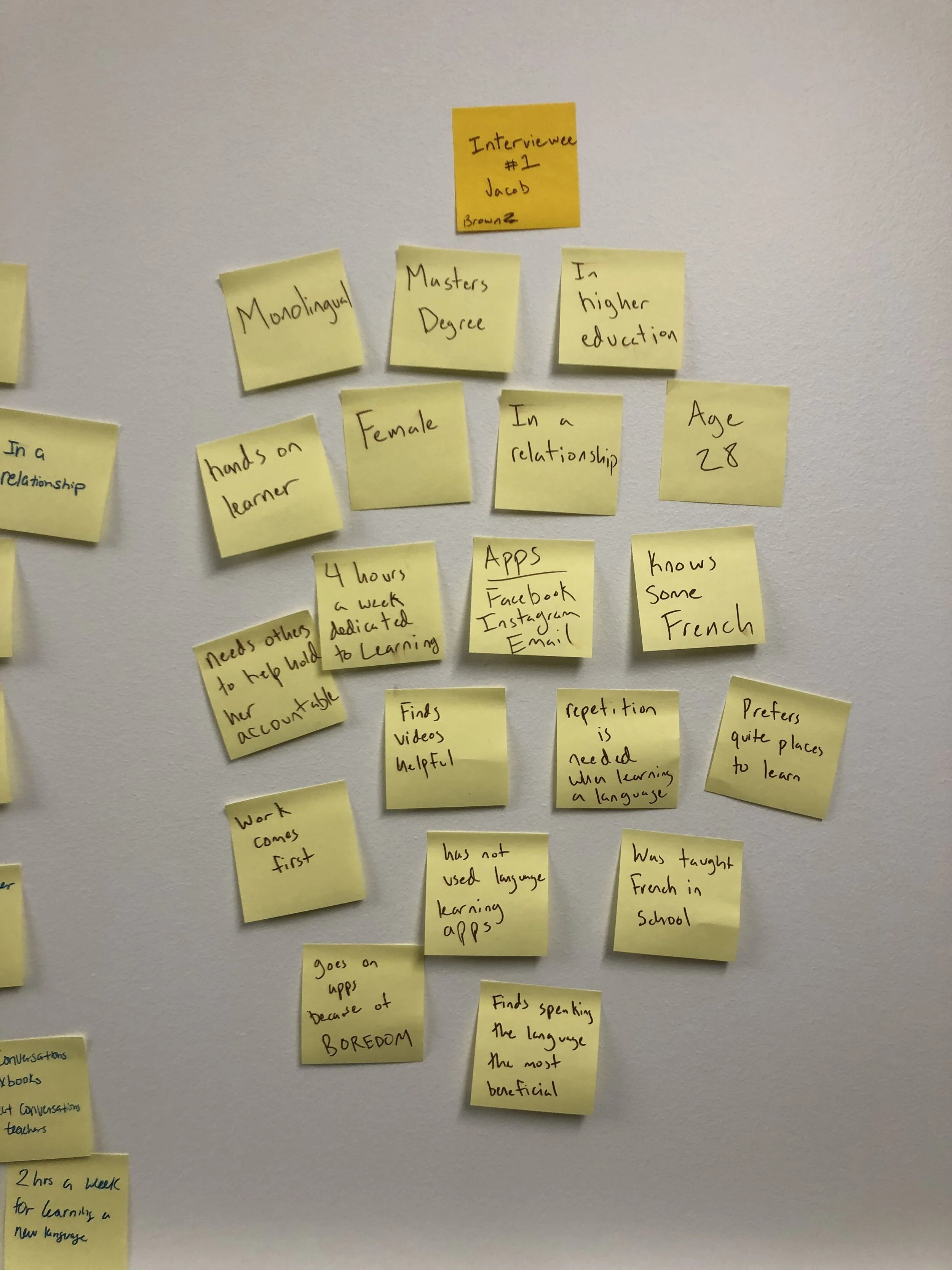
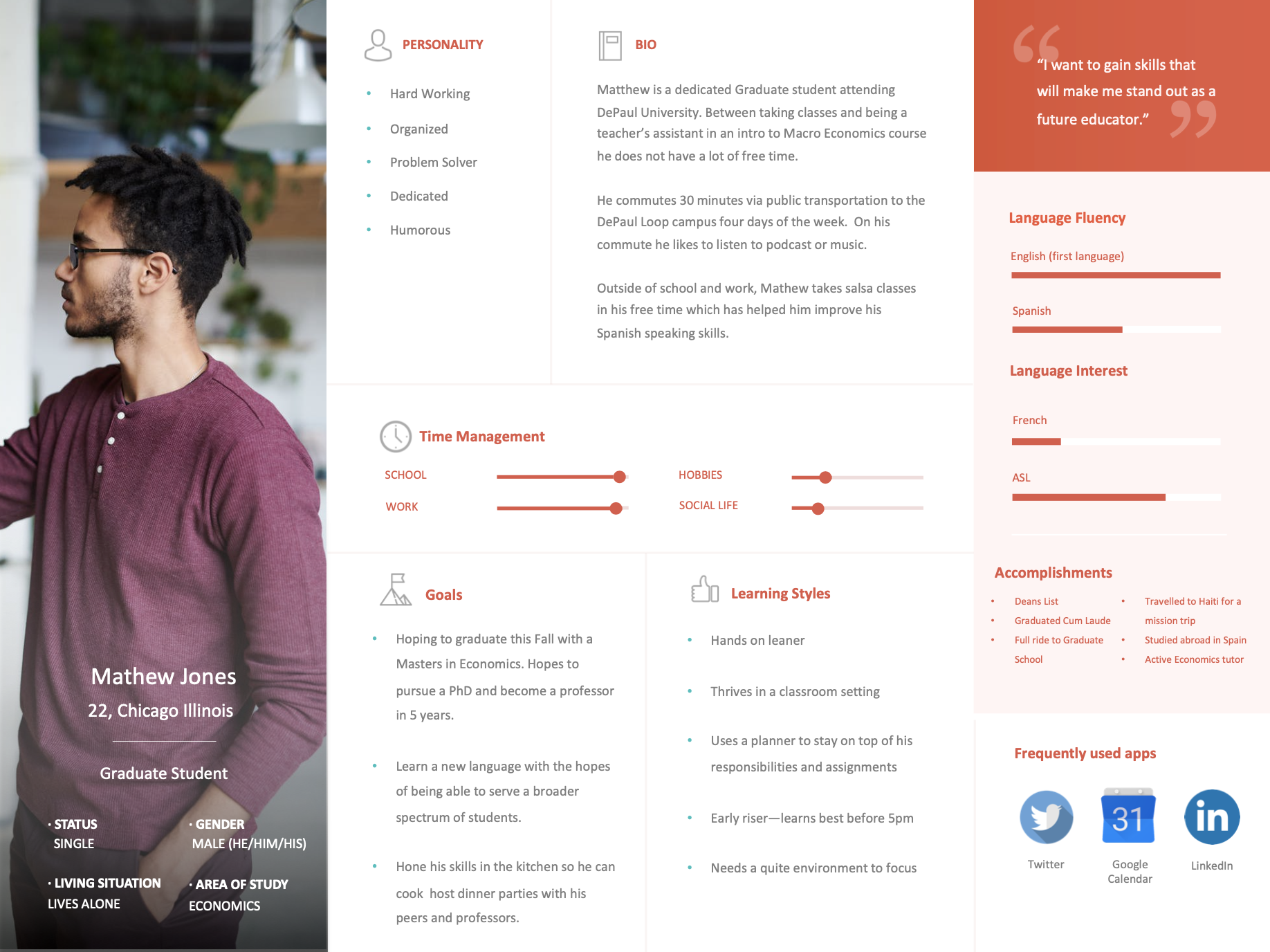
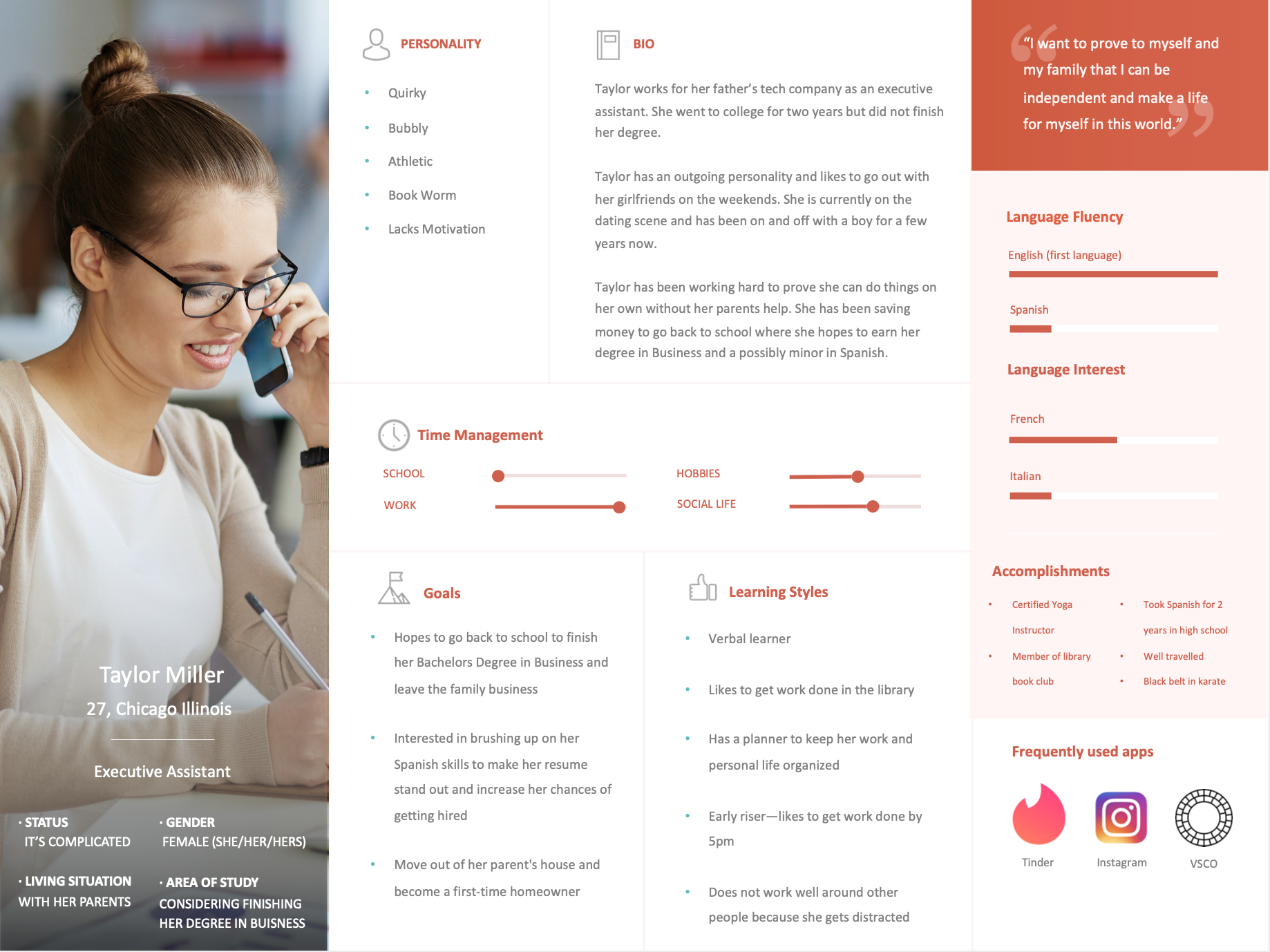
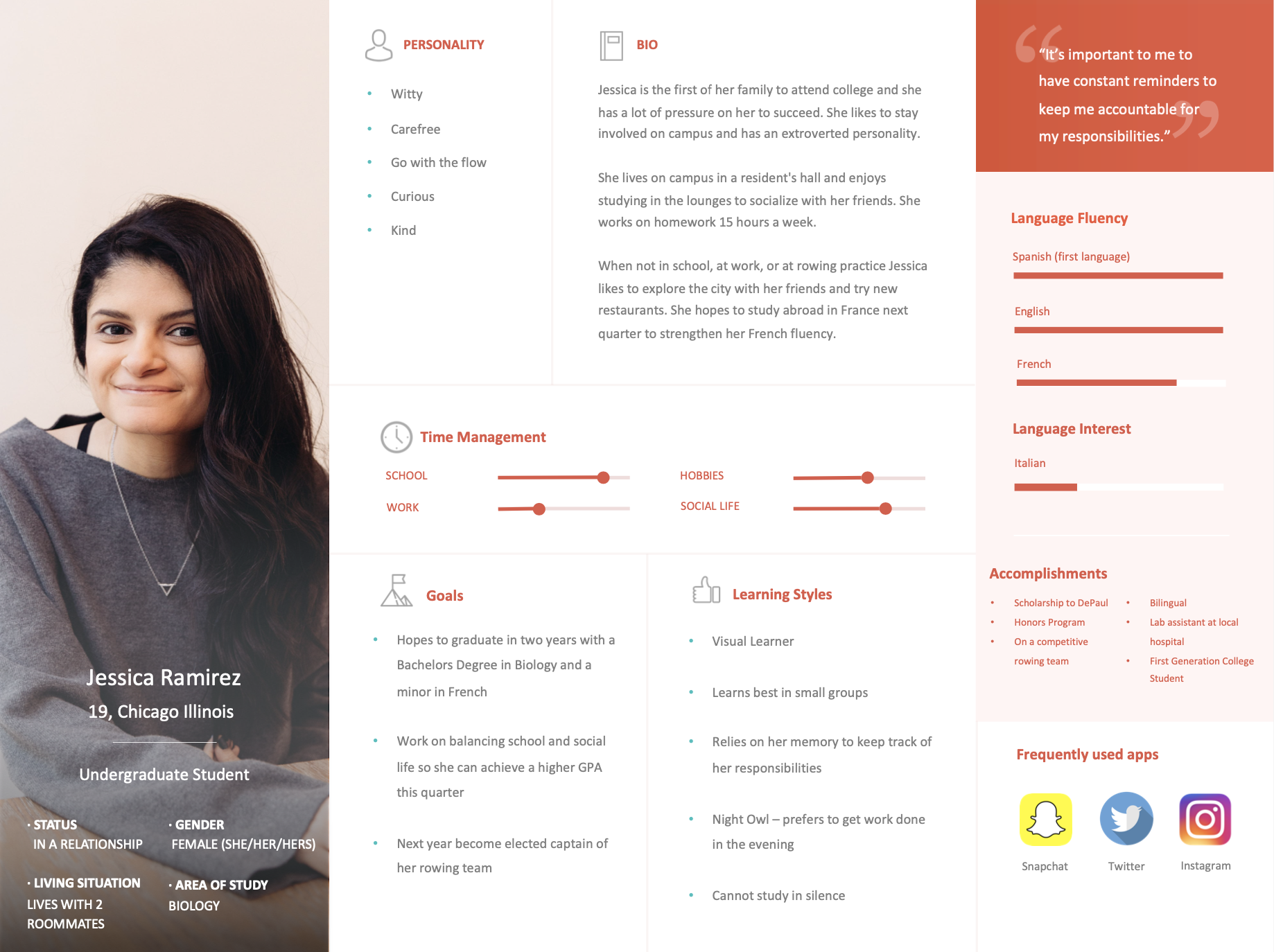
Following the interviews, we meticulously transcribed and analyzed the data, utilizing affinity diagrams to distill significant themes. This process informed the creation of 3 user personas (pictured below after interview findings), providing clarity on Drops' target audience.
Interview Findings
Desire to learn
A vast majority of our interviewees recounted instances where they found themselves in unfamiliar language environments, experiencing discomfort, stress, or a sense of awkwardness. Consistently, they expressed a deep-seated desire to comprehend and engage with the language being spoken.
Language Experience
Out of the 9 interviewees, 2 identified as monolingual, while another 2 reported that English was not their first language. Notably, all participants had received formal language instruction in a school setting.
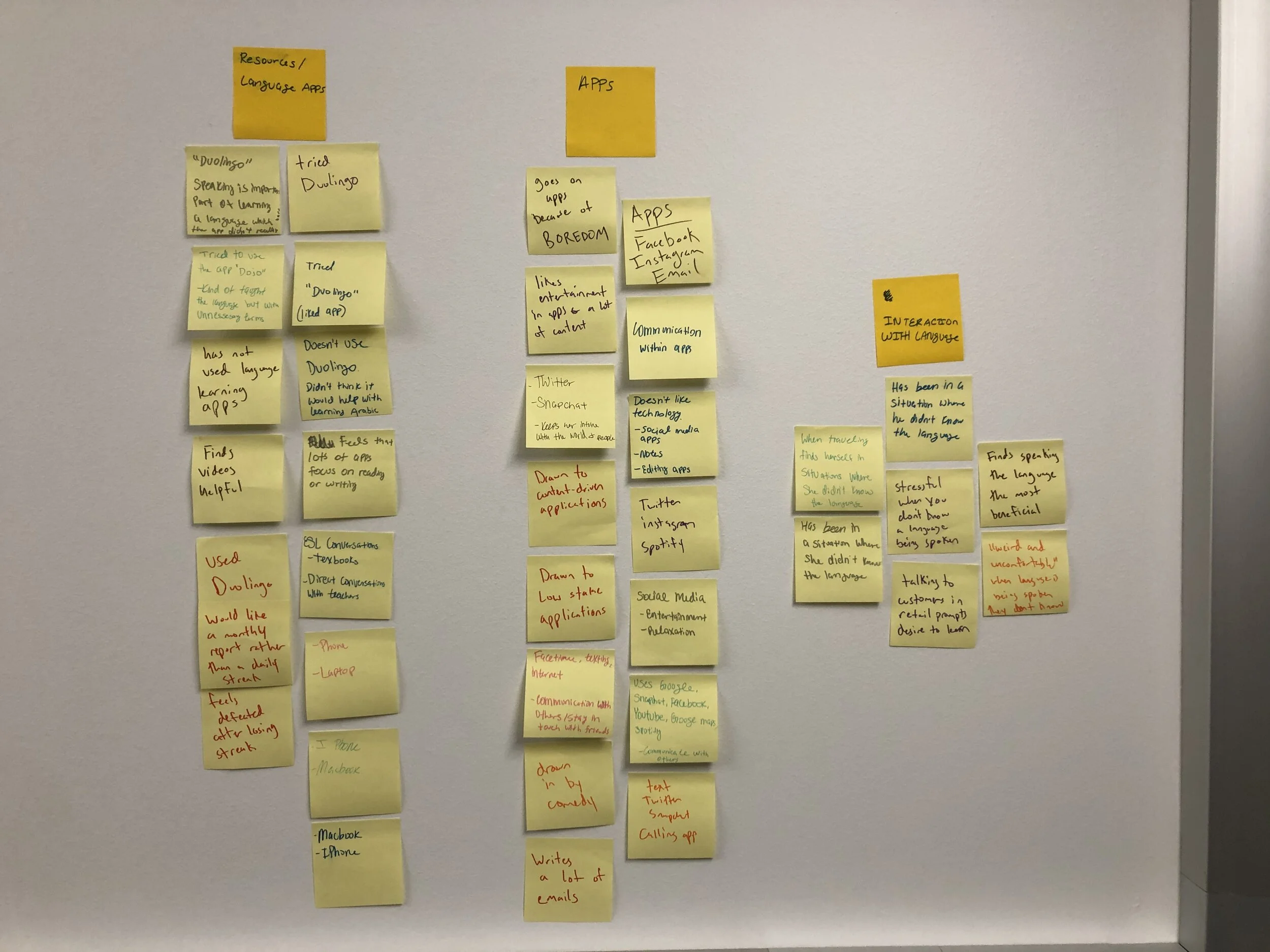
Preferred Apps
According to our interviewees, the apps they overwhelmingly use the most are communication apps, facilitating connections with family, friends, and the broader world.
Education Level
Analysis of our demographic questions revealed that all interviewees were well-educated, with some actively engaged in full-time employment.
Learning Style
The majority of our interviewees expressed a preference for a classroom environment for their learning and acknowledged a tendency to get easily distracted.
Task-Based User Testing
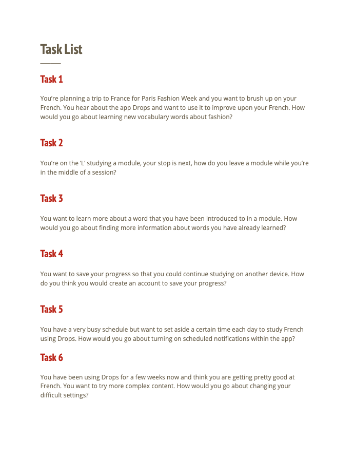
After formulating our affinity diagram and establishing user personas, we crafted a set of tasks for our users to undertake during testing.
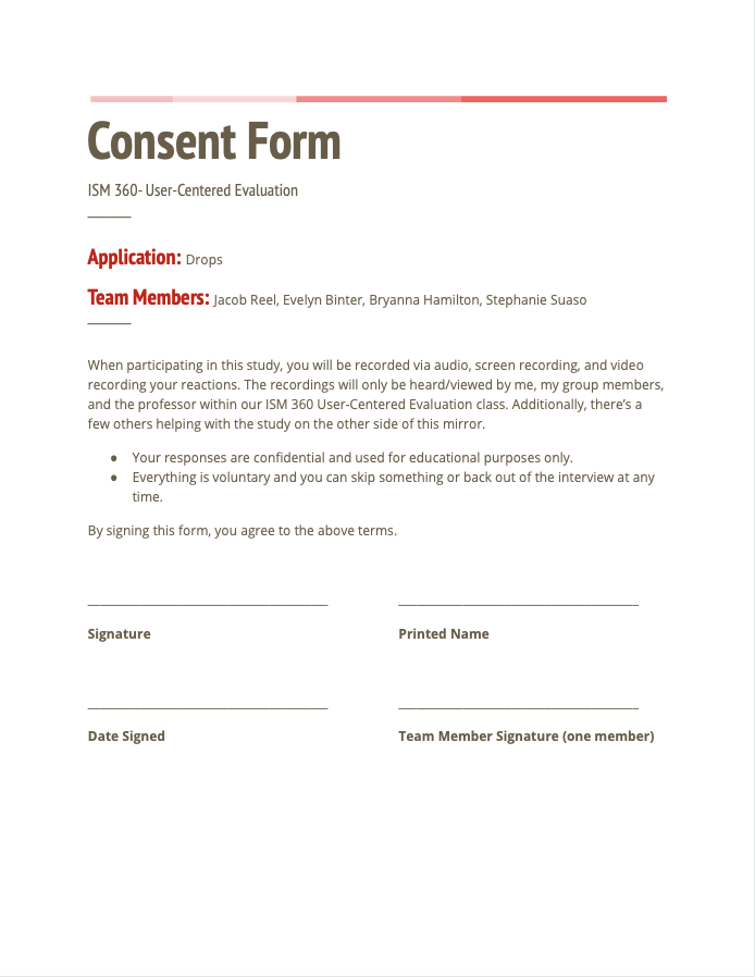
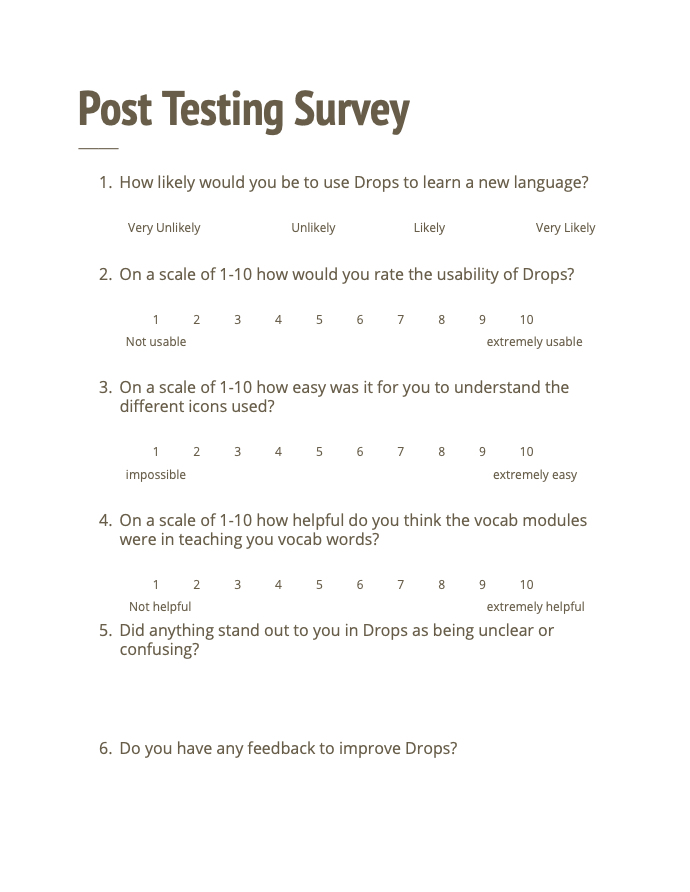
We recruited 9 individuals aligning with the characteristics identified in our user personas. The testing took place in a state-of-the-art usability lab, equipped with a two-way mirror and Morae recording software.
Before commencing the test, participants provided their consent by signing a form, and upon completion, they filled out a post-test survey. Following the conclusion of the tests, we meticulously compiled a comprehensive usability report, outlining all of our key findings.
Usability Test - Task 2
In this segment, we instructed a participant to exit a module in the midst of a lesson.
Although the user swiftly recognized the need to pause the module, there was apprehension about selecting '“quit” due to concerns about potential progress loss (despite "quit" being the correct action to leave a module and save progress).
Even after opting to click “quit,” the user remained uneasy about the security of their progress.
Solution: To mitigate user confusion, a straightforward remedy for this usability flaw would be to modify the wording to “save and quit,” providing users with clarity that their progress will be preserved.
Findings:
Users experienced confusion with the use of military time when setting scheduled notifications.
Visual appeal varied among participants, with some finding the app attractive and others feeling overwhelmed.
“I would like more in-depth games”
Uncertainty existed among users regarding the correct method to exit a module and save progress using the pause button.
Confusion arose about whether to repeat the words presented in the vocabulary modules
“I’m not sure if I’m actually learning”
Recommendations
Tone down the design.
While the design of Drops is visually stunning, our research revealed that it has a tendency to distract users. In the context of a language-learning app, minimizing distractions is crucial for optimal user engagement. The interface design should not act as a distraction or compromise the legibility of the content.
Don’t hide the ‘exit module’ button.
During our user testing, we identified that exiting a module posed a significant challenge for users. To access the 'exit module' button, users were required to first pause the module and then select 'exit module'. Users did not anticipate that pressing a pause button would trigger a menu. Placing the 'exit module' button directly on the module screen would provide a more intuitive way for users to exit modules once they have completed them.
Get rid of military time.
When users initially open the app, they are prompted to choose a time for scheduling notifications. Through user testing, we discovered that the use of military time led to confusion among users and frequently extended the time it took them to complete the task of setting up notifications.
Separate the profile and settings page.
The coexistence of the profile and settings sections on one page results in significant clutter and confusion for users. Navigating this page proves challenging, with users frequently expressing confusion that the settings section is located under the profile tab. A simple solution would be to relocate the settings section to the toolbar and to give the profile page its own section. This adjustment would enhance user clarity and facilitate easy differentiation between the two sections.